A very interesting use to maps,
yet another reasons reading maps is a favorite past time of mine.
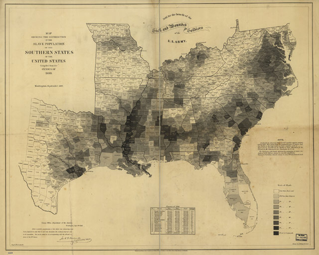
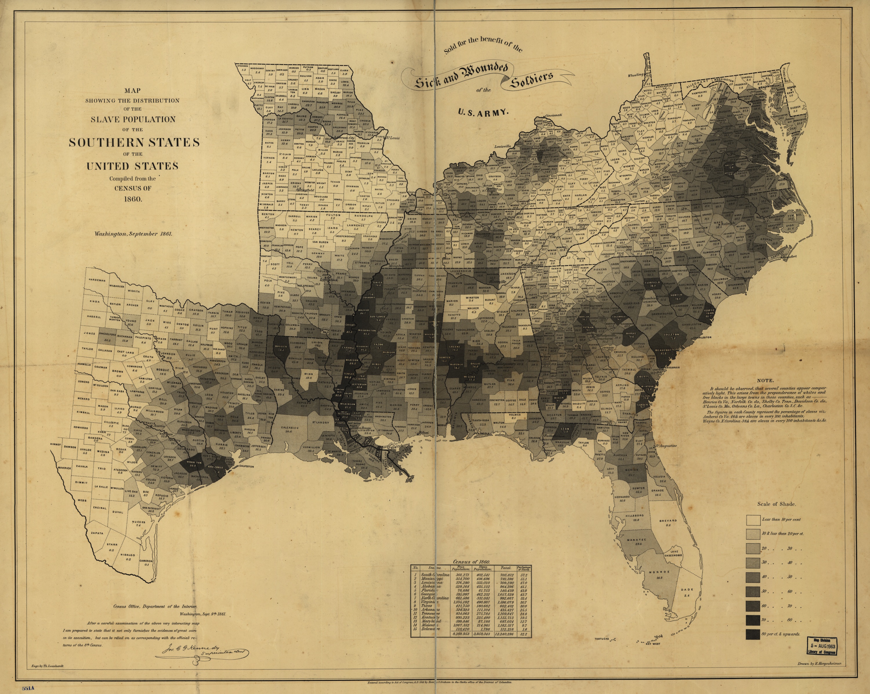
Using data from the 1860 US Census, the Department of the Interior made this map showing the percentages, by county, of the slave population of the southern states.
Though this map was simple, it showed the relationship between states' commitment to slavery and their enthusiasm about secession, making a visual argument about Confederate motivations.Schulten writes that President Lincoln referred to this particular map often, using it to understand how the progress of emancipation might affect Union troops on the ground. The map even appears in the familiar Francis Bicknell Carpenter portrait First Reading of the Emancipation Proclamation of President Lincoln, visible leaning against a wall in the lower right-hand corner of the room.
Here's a larger version. The numbers in some locations are staggering and sickening -- in many counties 75% of the population was enslaved and the rate is over 90% in a few places.
via {kottke}

0 comments:
Post a Comment