I have become a semi-improvisational chef recently,
making many learning mistakes,
and accidentally throwing away more food than I like.
I loved these visual and organizational qualities of these graphs for ideas and inspiration!
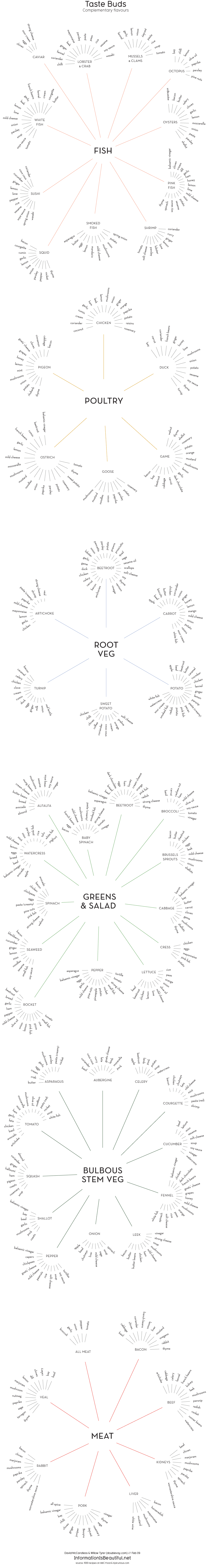
A visualization of complementary flavours by David McCandless and Willow Tyrer.
All food tastes amazing, just sometimes not together. So we roved around 1000 recipes for common flavour patterns and visualized the results.
A good way to build a meal, maybe, if you lack a chef’s intuitive buds. Less data visualization, more dinner visualization. An infoodgraphic, perhaps. Ok, we’ll stop now.
These were created back in 2009 for the Information Is Beautiful book. Willow, a Swedish infographic designer, came up with an elegant, organic style. We thought it might be nice to release them into the wild.
Enjoy your meal!
 |
| via {information is beautiful} |

0 comments:
Post a Comment